Light Sticks in K-pop
While it is a practical item to have in dark concert venues, light sticks act more like a symbol of fans’ unity and strength.
It enables artists to look out into a crowd and see a sea of their trademark color being emitted from light sticks they have created.
Although they typically have the same purpose, artists put in the effort to add a special twist to their light sticks, whether it be using a specific color, type of aesthetic, or certain shape.
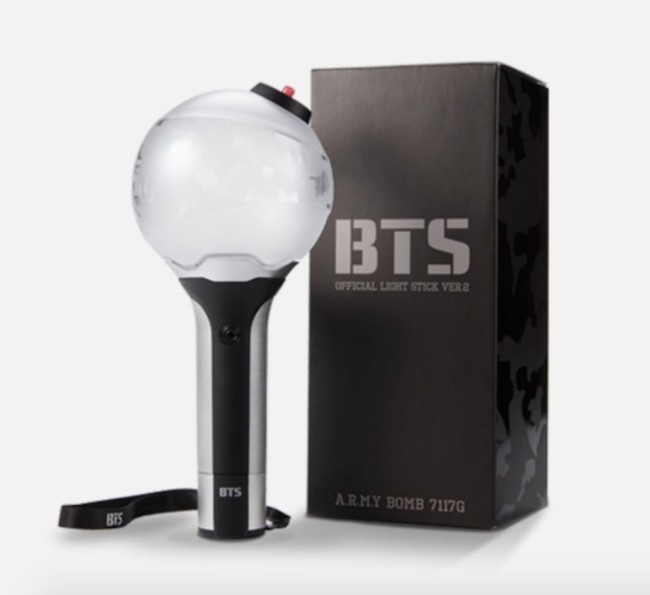
BTS
The group’s first light stick was released on its fan site in 2015, two years after its debut.
A gray bomb atop a simple black stand, the design is simple and bold. The sphere is thought to symbolize a globe, representing the group’s growing international popularity. In 2017, a second edition of the light stick was released with a more translucent sheen, refined tip, and sleeker stand.
On July 5, a teaser for the third version of the light stick was shared with fans, featuring a similar concept in a darker tone.
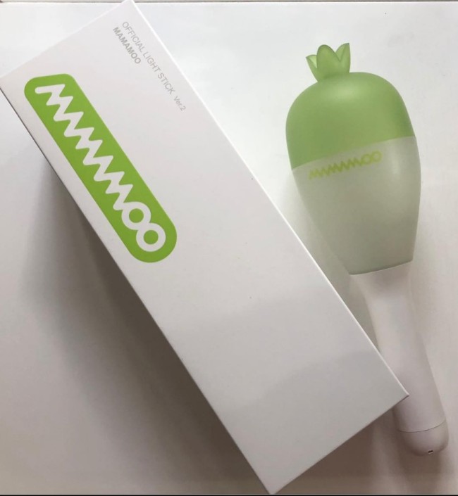
Mamamoo
Perhaps the most playful of designs, Mamamoo has used a radish shape for its light stick because “moo” in Korean translates to radish in English.
Similar to the shape of a maraca, the first version from 2015 was white and green, complete with an adornment acting as a radish top.
Mamamoo announced its second light stick in 2017, which has mostly internal improvements. The biggest being that with the new version, users have the option of 256 colors, along with the ability to make it vibrate.